Centerstone
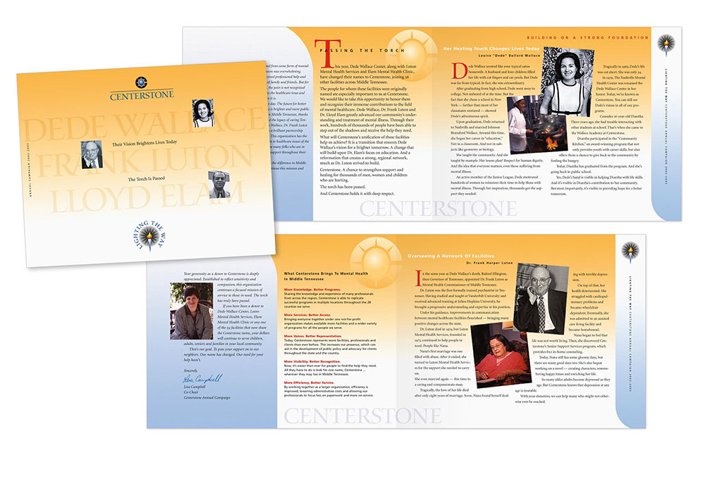
A public relations firm asked us to develop collateral materials and update the website for the largest mental health care provider in Tennessee as they brought their individually-named clinics under a uniform umbrella—Centerstone.
The time was right to update their logo, so we were asked to tweak the existing design and also given latitude to offer other solutions. We presented several reworked versions of the old logo, along with a new design that gave Centerstone a unique symbol.
Reaction to the new design was universally positive, and after exploring various color options, it was decided to stay with blue, though a deeper, bolder shade than previously used.
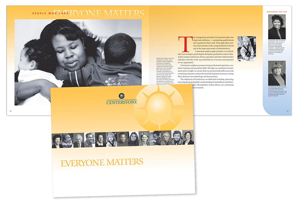
While designing the print materials, we developed a bright palette to contrast with the blue and visually hint at brighter futures for Centerstone’s patients.
Deliverables
Design & Production
- Design & Production
- Logo
- Business papers—letterhead, envelope, and business card
- Website
- Advertising
- Billboards
- Annual fund brochures
- Direct mail pieces
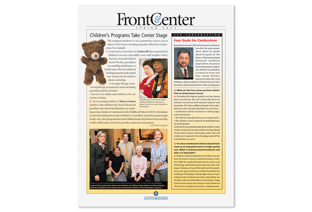
- Newsletter
- Annual report


